
Plan, write and ship in one place. Every page in your workspace follows the same design system, so nothing drifts.
Fast by default
Pages load in under a second, with nothing to configure.
Built for teams
Shared spaces, comments and roles that match how you work.
Secure from day one
SSO, audit logs and encryption at rest on every plan.
Create your account
Send me product updatesCreate accountnpm install @northwind/sdk
Pro
- Unlimited pages
- Version history
- Priority support
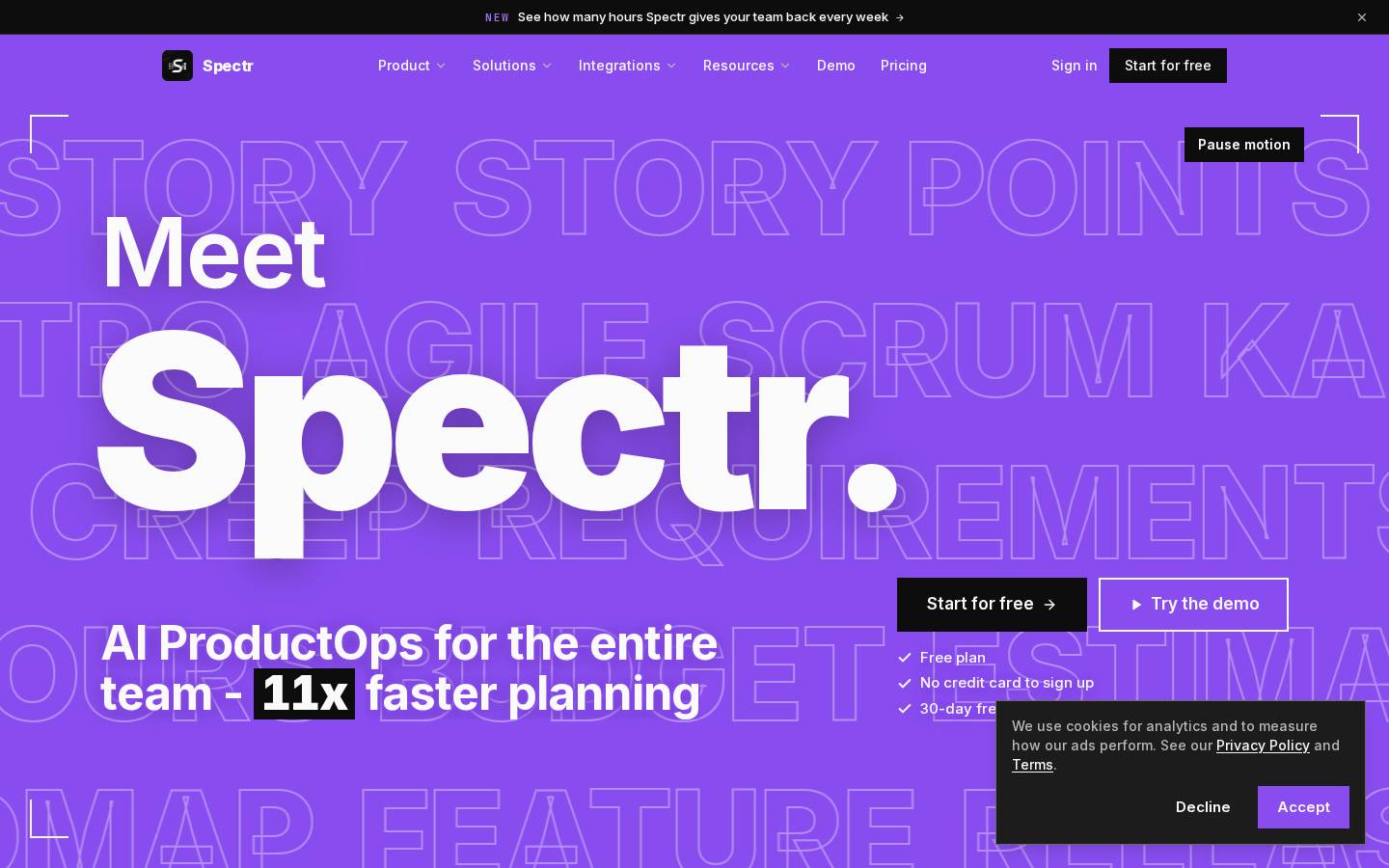
Started from
spectr.pmPreview
the remixed design systemSwitch between the rendered Visual preview and the Raw DESIGN.md.
Spectr Remix
Remix of spectr.pm. The colors, fonts and shapes were edited in DesignMD. The token block above has the current values. The sections below were written for the original, so they may still mention it.
1. Visual Theme & Atmosphere
Spectr's design system radiates a premium, forward-thinking energy grounded in a deep dark palette punctuated by vibrant purple. The aesthetic is minimalist yet bold, favoring stark contrast—crisp white text and UI surfaces against near-black backgrounds—paired with generous whitespace and geometric precision. Sharp edges (no border radius) reinforce a tech-first, no-nonsense character, while the signature purple ({colors.primary} — #8867C1) acts as the energetic counterpoint, drawing attention to primary actions and moments of emphasis. Typography is authoritative and modern, with aggressive tracking on display sizes that commands presence. The overall mood is sophisticated and purposeful: a tool for serious builders who demand clarity and efficiency.
Key Characteristics
- Deep dark foundation (
{colors.canvas}—#0D0D0D) creating visual weight and focus - High contrast between text (
{colors.on-primary}—#FAFAFA) and surfaces - Electric purple (
{colors.primary}—#8867C1) as the primary action and brand anchor - Sharp geometry—zero border radius across all components
- Negative letter-spacing on display typography for visual compression and impact
- Minimal shadow depth; color blocking replaces layered elevation
- Responsive typography that scales boldly across breakpoints
2. Color Palette & Roles
Primary
- Brand / Primary (
{colors.primary}—#8867C1): Primary CTA fills, active states, brand accent, hero highlight overlays, and emphasis in secondary UI (badges, highlights)
Interactive
- Primary Hover (derived from
{colors.primary}): State change on primary button interaction; lighter purple used on hover
Neutral Scale
- Canvas (
{colors.canvas}—#0D0D0D): Default page background, full-bleed sections, and primary container fill - Surface (
{colors.surface}—#171717): Card and panel backgrounds, nested containers, elevated content areas - Ink / On Primary (
{colors.on-primary}—#FAFAFA): Primary heading text, labels, button text on brand surfaces, and high-contrast foreground - Body (
{colors.body}—#B8B8B8): Body copy, secondary text, and secondary labels - Neutral (Medium) (
{colors.neutral-1}—#6B6B6B): Tertiary text, disabled states, and muted foreground - Hairline (
{colors.hairline}—#2E2E2E): 1px borders, dividers, and subtle edge definitions - Neutral (Deep) (
{colors.neutral-3}—#262626): Secondary surface accents and border fills
Surface & Borders
- Deep Black (
{colors.neutral-2}—#000000): Unused / reserved - Accent Palette (decorative, no measured role):
{colors.accent-1}(#A273F2): Lighter purple; not assigned a functional role{colors.accent-2}(#14532D): Deep forest; decorative only{colors.accent-3}(#78350F): Dark brown; decorative only{colors.accent-4}(#166534): Forest green; decorative only{colors.accent-5}(#4ADE80): Bright green; decorative only{colors.accent-6}(#92400E): Burnt brown; decorative only{colors.accent-7}(#FBBF24): Amber/gold; decorative only
3. Typography Rules
Font Family
Primary: Inter (fallback stack: -apple-system, BlinkMacSystemFont, "Segoe UI", Roboto, "Helvetica Neue", sans-serif)
Monospace / Code: JetBrains Mono (fallback stack: "Courier New", monospace)
Hierarchy
| Role | Font | Size | Weight | Line Height | Letter Spacing | Notes |
|---|---|---|---|---|---|---|
| Display XXL | Inter | 288px | 900 | 1.0 | -11.52px | Uppercase; hero banner only |
| Display XL | Inter | 200px | 900 | 1.0 | -8px | Uppercase; display/masthead |
| Display LG | Inter | 132px | 800 | 1.5 | -2.64px | Large hero headline |
| Display MD | Inter | 72px | 800 | 1.0 | -2.52px | Major section headline |
| Display SM | Inter | 48.96px | 700 | 1.08 | -0.98px | Section intro heading |
| Display XS | Inter | 44px | 800 | 1.05 | -1.32px | Secondary heading |
| Heading XL Strong | Inter | 30px | 700 | 1.2 | -0.6px | Card title, major block heading |
| Heading XL | Inter | 30px | 600 | 1.2 | -0.75px | Section heading alternative |
| Heading LG | Inter | 24px | 700 | 1.33 | -0.48px | Subsection title |
| Heading MD | Inter | 20px | 700 | 1.4 | 0px | Card heading, tertiary title |
| Heading SM | Inter | 19px | 600 | 1.5 | 0px | Small heading, label emphasis |
| Heading XS | Inter | 16px | 600 | 1.5 | 0px | Smallest heading, strong label |
| Button LG | Inter | 19px | 700 | 1.5 | -0.38px | Large CTA button text |
| Button MD | Inter | 12px | 500 | 1.33 | 0px | Small/secondary button text |
| Body XL | Inter | 19px | 500 | 1.55 | 0px | Lead/emphasis copy |
| Body LG | Inter | 18px | 600 | 1.56 | 0px | Subheading body text |
| Body MD | Inter | 16px | 500 | 1.6 | 0px | Standard body copy |
| Body SM | Inter | 15px | 500 | 1.55 | 0px | Fine print, secondary text |
| Body XS Strong | Inter | 14px | 600 | 1.43 | 0px | Emphasis in compact text |
| Body XS | Inter | 14px | 500 | 1.43 | 0px | Small body, helper text |
| Caption XS Strong | Inter | 12px | 600 | 1.0 | 0px | Label, mini badge text |
| Caption XS | Inter | 12px | 500 | 1.38 | 0px | Smallest caption, annotation |
| Code LG | JetBrains Mono | 14px | 600 | 1.43 | 1.68px | Large code/snippet; uppercase |
| Code MD | JetBrains Mono | 13px | 600 | 1.5 | 1.82px | Standard code; uppercase |
| Code SM Uppercase | JetBrains Mono | 12px | 500 | 1.33 | 1.2px | Compact code token; uppercase |
| Code XS Strong | JetBrains Mono | 11px | 600 | 1.5 | 1.32px | Small code emphasis; uppercase |
| Code XS | JetBrains Mono | 11px | 500 | 1.5 | 0.44px | Tiny code reference |
| Code SM | JetBrains Mono | 12px | 500 | 1.7 | 0.72px | Inline code snippet |
Principles
- Aggressive tracking on display sizes: Large headlines use strong negative letter-spacing (up to -11.52px) to compress letterforms and create visual punch; this is a defining trait of the brand voice.
- Weight hierarchy: Display and heading roles favor 700–900 weights for authority; body text sits at 500–600 for legibility and calm.
- Line-height discipline: Headings use tight line-height (1.0–1.2) for compact, commanding presence; body text opens to 1.5–1.6 for reading comfort.
- Code is monospace and uppercase: Technical tokens use JetBrains Mono with uppercase transforms and letter-spacing to mark them as distinct, machine-readable text.
- Font weight does semantic work: Bold weights signal emphasis; regular weights (500) are default; the system avoids 400 entirely.
4. Component Stylings
Buttons
Primary Button (Large)
- Background:
#8867C1({colors.primary}) - Text Color:
#FAFAFA({colors.on-primary}) - Font: Inter, 19px, weight 700, letter-spacing -0.38px (
{typography.button-lg}) - Padding: 0px 28px (height: 56px)
- Border: 2px solid
#FAFAFA({colors.on-primary}) - Border Radius: 0px (sharp corners)
- Box Shadow: None
- Line Height: 1.5 (25.5px)
- Width: 197px
Primary Button (Small)
- Background:
#8867C1({colors.primary}) - Text Color:
#FAFAFA({colors.on-primary}) - Font: Inter, 14px, weight 500 (
{typography.body-xs}) - Padding: 8px 16px (height: 36px)
- Border: None
- Border Radius: 0px
- Box Shadow: None
- Line Height: 1.43 (20px)
- Width: 122px
Secondary Button (Filled)
- Background:
#262626({colors.neutral-3}) - Text Color:
#FAFAFA({colors.on-primary}) - Font: Inter, 15px, weight 600 (
{typography.body-sm}) - Padding: 0px 20px (height: 44px)
- Border: 1px solid
#6B6B6B({colors.neutral-1}) - Border Radius: 0px
- Box Shadow: None
- Line Height: 1.5 (22.5px)
- Width: 238px
Text Button (Ghost)
- Background: Transparent (
rgba(0, 0, 0, 0)) - Text Color:
#FAFAFA({colors.on-primary}) - Font: Inter, 14px, weight 500 (
{typography.body-xs}) - Padding: 8px 12px (height: 36px)
- Border: None
- Border Radius: 0px
- Box Shadow: None
- Line Height: 1.43 (20px)
- Width: 127px
Text Button with Background
- Background:
#0D0D0D({colors.canvas}) - Text Color:
#FAFAFA({colors.on-primary}) - Font: Inter, 14px, weight 600 (
{typography.body-xs-strong}) - Padding: 0px 14px (height: 36px)
- Border: None
- Border Radius: 0px
- Box Shadow: None
- Line Height: 1.43 (20px)
- Width: 124px
Cards & Containers
Standard Card
- Background:
#171717({colors.surface}) - Text Color:
#FAFAFA({colors.on-primary}) - Font: Inter, 16px, weight 500 (
{typography.body-md}) - Padding: 16px
- Border: 1px solid
#2E2E2E({colors.hairline}) - Border Radius: 0px
- Box Shadow: None
- Line Height: 1.6 (24px)
- Height: ~292px (varies by content)
Large Card / Section Container
- Background:
#171717({colors.surface}) - Text Color:
#FAFAFA({colors.on-primary}) - Font: Inter, 16px, weight 500 (
{typography.body-md}) - Padding: 128px 0px (vertical padding; horizontal varies with viewport)
- Border: None
- Border Radius: 0px
- Box Shadow: None
- Line Height: 1.6 (24px)
Inputs & Forms
Text Input (on Hover)
- Border Color on Hover: Updates to brand or primary state (specific values not fully extracted)
- Border Radius: 0px (inferred from component pattern)
- Background: Inherit from surface or canvas
- Text Color:
#FAFAFA({colors.on-primary})
Navigation
Navigation Bar (Default)
- Background: Transparent (
rgba(0, 0, 0, 0)) - Text Color:
#FAFAFA({colors.on-primary}) - Font: Inter, 16px, weight 500 (
{typography.body-md}) - Padding: 0px (inline padding per link)
- Border: None
- Border Radius: 0px
- Box Shadow: None
- Line Height: 1.6 (24px)
- Height: 36px (link height, not bar height)
Navigation Hover State
- Background on Hover: Updates to secondary color or accent (exact role not fully extracted)
- Text Color: Remains
#FAFAFAor shifts per state
Footer
Footer Section
- Background: Transparent (
rgba(0, 0, 0, 0)) - Text Color:
#FAFAFA({colors.on-primary}) - Font: Inter, 16px, weight 500 (
{typography.body-md}) - Padding: 0px (structured per section)
- Border: 1px solid
#2E2E2E({colors.hairline}) - Border Radius: 0px
- Line Height: 1.6 (24px)
Links
Link (Large)
- Background:
#0D0D0D({colors.canvas}) - Text Color:
#FAFAFA({colors.on-primary}) - Font: Inter, 18px, weight 600 (
{typography.body-lg}) - Padding: 0px 32px (height: 60px)
- Border: None
- Border Radius: 0px
- Box Shadow: None
- Line Height: 1.56 (28px)
- Width: 320px
Link (Small)
- Background:
#0D0D0D({colors.canvas}) - Text Color:
#FAFAFA({colors.on-primary}) - Font: Inter, 17px, weight 600
- Padding: 0px 28px (height: 56px)
- Border: None
- Border Radius: 0px
- Box Shadow: None
- Line Height: 1.5 (25.5px)
- Width: 197px
5. Layout Principles
Spacing System
Spectr uses a modular 4px base unit scaled in steps for consistent rhythm. The scale accommodates both tight micro-interactions and generous section breathing room.
{spacing.xxs}= 4px (tight pairs, icon-to-text){spacing.xs}= 8px (compact list items, icon spacing){spacing.sm}= 12px (button padding, small gaps){spacing.md}= 16px (body paragraph gaps, standard component padding){spacing.lg}= 24px (section dividers, card padding){spacing.xl}= 28px (button horizontal padding){spacing.xxl}= 32px (feature padding, generous margin){spacing.xxxl}= 40px (large section offset){spacing.section}= 44px (vertical section spacing){spacing.band}= 48px (major hero/band padding, large-scale rhythm)
Grid & Container
- Max Width: Viewport-dependent; at 1440px, the container column is 1376px (leaving ~32px margin on each side)
- Strategy: Full-bleed sections with responsive inner content containers; no fixed column grid at mobile/tablet (content reflows). Desktop layouts employ CSS Grid with 5-column strategy for complex sections.
- Section Patterns: Full-width hero bands with centered content; card grids that collapse from 5→3→1 column(s) across breakpoints.
Whitespace Philosophy
Whitespace is deliberate and generous. Sections are separated by substantial vertical rhythm ({spacing.band} = 48px and above) to create breathing room and visual hierarchy. Inline whitespace uses tighter units ({spacing.md} = 16px for paragraph gaps, {spacing.sm} = 12px for list items) to maintain reading flow. The design favors "space as signal"—gaps between elements direct attention and define logical groupings.
Border Radius Scale
- None (
{rounded.none}= 0px): All interactive and structural components (buttons, cards, inputs, navigation) use sharp corners. The system is uniformly rectilinear; there are no pill-shaped or rounded variants.
Border Widths
- Thin (1px): Card borders, dividers, input borders (default state)
- Medium (2px): Primary button border, strong accent lines
- No thick (3px+) borders measured; the system favors minimal stroke weight.
6. Depth & Elevation
| Level | Treatment | Use |
|---|---|---|
| Flat | No shadow; color blocking (surface change) | Cards, panels, default containers |
| Elevated (sm) | rgba(0, 0, 0, 0.1) 0px 10px 15px -3px, rgba(0, 0, 0, 0.1) 0px 4px 6px -4px | Dropdowns, floating UI, modals |
Shadow Philosophy: Spectr relies primarily on color blocking (surface color shifts) rather than shadows to define depth. The single shadow tier (sm) is reserved for floating/modal components that need to visually lift above the page. The effect is subtle—two-layer shadow with 10% opacity—reinforcing the minimalist, contemporary aesthetic. Most UI depth comes from background color contrast: canvas (#0D0D0D) → surface (#171717) creates visual separation without blur.
Opacity Levels
The system employs opacity for state indication and visual softening:
- 100% (
1.0): Default, full-strength text and elements - 94% (
0.94): Near-full opacity; subtle disabled or overlay softening - 90% (
0.90): Slightly dimmed text or secondary layers - 70% (
0.70): Disabled buttons or inactive states - 65% (
0.65): Muted foreground or tertiary text - 36% (
0.36): Low-contrast backgrounds, overlay tints, placeholder text
Z-index / Layering
- Base / Flat:
z-index: 1(default, unlifted elements) - Dropdown:
z-index: 10orz-index: 50(floating menus, select dropdowns—two tiers suggest fallback behavior) - Modal / Fixed: Inferred to be higher than 50 (not explicitly measured; see Known Gaps)
7. Do's and Don'ts
Do
- Use the primary purple (
{colors.primary}—#8867C1) for all primary CTAs, active states, and brand moments—it is the visual anchor. - Maintain sharp corners (0px border-radius) on all components; the rectilinear geometry is a core identity trait.
- Apply negative tracking on display sizes (use the specified letter-spacing values); this compression is a defining brand voice element.
- Rely on color blocking for depth: stack surface colors (
canvas→surface) rather than layering shadows. - Space sections generously with
{spacing.band}(48px) and above; whitespace is a design tool, not wasted space. - Use high contrast between
{colors.on-primary}(#FAFAFA) text and dark backgrounds for readability and impact. - Employ the Inter font family for all body and heading text; it is refined, modern, and consistent with the brand.
- Weight text deliberately: use 600+ for headings, 500–600 for body, reserving heavier weights (700–900) for display.
Don't
- Avoid rounded corners or pill-shaped buttons; the system is sharp and modern, not organic or playful.
- Don't invent new colors outside the measured palette; the dark neutrals and purple create the mood—stick to them.
- Do not layer multiple shadows for depth; use the single-tier shadow only for floating UI (dropdowns, modals), and prefer color blocking otherwise.
- Avoid positive (rightward) letter-spacing on display headlines; the brand voice uses compression (negative tracking).
- Don't use the decorative accent palette (
{colors.accent-1}through{colors.accent-7}) for functional UI; these colors have no defined role and will dilute the visual system. - Never reduce line-height below 1.0 on body text; the measured hierarchy respects legibility—don't compress body copy.
- Avoid thin font weights (400 or below); the system uses 500 as its minimum, ensuring weight and clarity.
8. Responsive Behavior
Breakpoints
| Breakpoint | Viewport Width | Content Column | Grid Columns | Largest Heading | Body Font | Notable Change |
|---|---|---|---|---|---|---|
| Mobile | 375px | 343px | 6-column layout | 40px | 16px | Full-width layout; nav links present (47 visible) |
| Tablet | 768px | 704px | 3-column layout | 41px | 16px | Two-column mid-content; increased padding |
| Desktop MD | 1024px | 960px | 5-column layout | 55px | 16px | Multi-column cards; larger headings |
| Desktop LG | 1280px | 1216px | 5-column layout | 69px | 16px | Headings scale further; increased section padding |
| Desktop XL | 1440px | 1376px | 5-column layout | 78px | 16px | Maximum content width; largest heading scale |
Derivation Note: Breakpoints were identified by measuring where layout values (content column width, grid columns, heading size) actually changed during resize. The nav link visibility remained at 46+ across all measured viewports; a menu toggle appears to be conditional (see Navigation Behavior, below) rather than a hard breakpoint.
Touch Targets
- Minimum Interactive Size: 44px (height of secondary buttons and nav links), expanded to 56px for primary CTAs
- Padding Inside Targets: At least
{spacing.md}(16px) of padding inside buttons to accommodate text and maintain comfortable tap/click zones - Spacing Between Targets: At least
{spacing.xs}(8px) between adjacent interactive elements to prevent accidental activation
Collapsing Strategy
- Mobile (375px): Full-width content with single-column layouts; cards stack vertically. Horizontal section padding collapses to 0px (full bleed). Typography scales down (display headings reduce to ~40–50px from 70+px on desktop).
- Tablet (768px): Content column widens to 704px; 3-column grid layouts for card grids. Heading sizes increase slightly (41–55px); section padding remains generous.
- Desktop (1024px+): Content column continues to expand; 5-column grid for complex layouts. Display headings scale progressively (55→78px). Horizontal section padding reaches max (typically 32px per side or full container width at 1376px).
- Navigation: Remains visible across all breakpoints as a horizontal menu (46 nav items visible at 375px, same count at 1440px). No hamburger menu collapse point observed in extraction.
9. Agent Prompt Guide
Quick Color Reference
- Primary CTA / Brand Accent: Primary (
#8867C1) - Page Background / Canvas: Canvas (
#0D0D0D) - Card / Panel Surface: Surface (
#171717) - Heading / Primary Text: On Primary (
#FAFAFA) - Body Copy / Secondary Text: Body (
#B8B8B8) - Tertiary / Muted Text: Neutral-1 (
#6B6B6B) - Borders / Hairlines: Hairline (
#2E2E2E) - Decorative Palette: Accents 1–7 (no functional role; avoid for UI)
Iteration Guide
- Start with the dark base: All surfaces begin with
{colors.canvas}(#0D0D0D) or{colors.surface}(#171717); this is non-negotiable. - Purple is the only accent: Use
{colors.primary}(#8867C1) for all primary actions, active states, and brand emphasis; no other accent color has a defined role. - Keep corners sharp: Set
border-radius: 0pxon all components—buttons, cards, inputs, images. The system has no rounded variants. - Text color is almost always on-primary: Use
{colors.on-primary}(#FAFAFA) for headings and primary labels; use{colors.body}(#B8B8B8) for body text; use{colors.neutral-1}(#6B6B6B) for disabled/tertiary. - Typography hierarchy drives visual structure: Display sizes (44px–288px) use aggressive negative letter-spacing; headings (16px–30px) use 600–700 weight; body (14px–19px) stays at 500–600. Never deviate from the measured table.
- Padding is modular: Use
{spacing.md}(16px) as the default; scale up/down by the power of 2 (8px, 12px, 24px, 32px, 48px). Consistency through modularity. - Depth comes from color, not shadow: Use one shadow tier (
sm) only for floating UI. Everything else relies on surface color contrast. - Opacity for state: Disabled elements use 0.5–0.7 opacity; overlays use 0.36–0.65 opacity. Full opacity (1.0) is default.
- Responsive grid scales: 1→3→5 columns across mobile/tablet/desktop. Full-width sections remain full-width; inner grids collapse.
- Measure everything in the extracted tokens: Never estimate a value. If a color, font size, spacing unit, or shadow is not in the token list, either omit it or record it under "Known Gaps."
10. Known Gaps
- No semantic color ramp: The site does not declare error, success, warning, or info states. Do not invent a status palette.
- No gradients or decorative meshes: The extraction found no CSS gradients, mesh backgrounds, or animated overlays. Color blocking is the only depth mechanism.
- 10 decorative accent colors without assigned role:
{colors.accent-1}through{colors.accent-7}have no measured functional use. They appear in the extracted palette but are not assigned to any UI component role. Avoid using them for standard UI. - Interaction states only partially extracted: Hover and focus states are documented in the raw extraction data, but not all transitions are complete. Specific hover colors for secondary buttons, links, and form inputs were referenced generically (e.g.,
hsl(var(--primary-hover))) without concrete hex values. Implement based on the primary and surface colors; where exact state behavior is uncertain, fall back to the base colors listed here. - Modal and fixed-layer z-index not explicitly measured: The extraction found
z-index: 10andz-index: 50for dropdowns; modal/fixed layers are inferred to be higher but were not directly measured. - Breakpoint collapse point for navigation unclear: The nav remains visible at 375px with 46+ links. No hamburger menu toggle was observed; the collapse strategy may be conditional (e.g., for very small screens or specific page contexts) and is not fully defined.
- Dark mode behavior not measured: No light theme or dark-mode toggle was observed or extracted. This document describes the single measured theme (dark).
- Surfaces behind authentication not visited: The extraction covered 6 pages of public site; logged-in dashboards or account settings may have additional component patterns or color roles not reflected here.
- CSS custom properties (HSL variables) used but not fully resolved: Interaction states in the raw data reference
hsl(var(--primary)),hsl(var(--ring)), etc. The actual HSL values these map to are not provided; use the hex equivalents listed in this document. - Overflow / scrolling behavior not measured: Sticky headers, scroll anchors, or lazy-load patterns were not extracted.
- Animation / motion timing not provided: The extraction did not capture CSS transitions, durations, or easing functions. No motion values are available for this system.
Design Tokens (YAML)
colors:
  primary: "#8867C1"
  accent-1: "#A273F2"
  accent-2: "#14532D"
  accent-3: "#78350F"
  accent-4: "#166534"
  accent-5: "#4ADE80"
  accent-6: "#92400E"
  accent-7: "#FBBF24"
  canvas: "#0D0D0D"
  surface: "#171717"
  on-primary: "#FAFAFA"
  body: "#B8B8B8"
  hairline: "#2E2E2E"
  neutral-1: "#6B6B6B"
  neutral-2: "#000000"
  neutral-3: "#262626"

typography:
  display-xxl:
    font-family: "Inter"
    font-size: "288px"
    font-weight: 900
    line-height: 1.0
    letter-spacing: "-11.52px"
    text-transform: "uppercase"
  display-xl:
    font-family: "Inter"
    font-size: "200px"
    font-weight: 900
    line-height: 1.0
    letter-spacing: "-8px"
    text-transform: "uppercase"
  display-lg:
    font-family: "Inter"
    font-size: "132px"
    font-weight: 800
    line-height: 1.5
    letter-spacing: "-2.64px"
  display-md:
    font-family: "Inter"
    font-size: "72px"
    font-weight: 800
    line-height: 1.0
    letter-spacing: "-2.52px"
  display-sm:
    font-family: "Inter"
    font-size: "48.96px"
    font-weight: 700
    line-height: 1.08
    letter-spacing: "-0.98px"
  display-xs:
    font-family: "Inter"
    font-size: "44px"
    font-weight: 800
    line-height: 1.05
    letter-spacing: "-1.32px"
  heading-xl-strong:
    font-family: "Inter"
    font-size: "30px"
    font-weight: 700
    line-height: 1.2
    letter-spacing: "-0.6px"
  heading-xl:
    font-family: "Inter"
    font-size: "30px"
    font-weight: 600
    line-height: 1.2
    letter-spacing: "-0.75px"
  heading-lg:
    font-family: "Inter"
    font-size: "24px"
    font-weight: 700
    line-height: 1.33
    letter-spacing: "-0.48px"
  heading-md:
    font-family: "Inter"
    font-size: "20px"
    font-weight: 700
    line-height: 1.4
    letter-spacing: "0px"
  heading-sm:
    font-family: "Inter"
    font-size: "19px"
    font-weight: 600
    line-height: 1.5
    letter-spacing: "0px"
  heading-xs:
    font-family: "Inter"
    font-size: "16px"
    font-weight: 600
    line-height: 1.5
    letter-spacing: "0px"
  button-lg:
    font-family: "Inter"
    font-size: "19px"
    font-weight: 700
    line-height: 1.5
    letter-spacing: "-0.38px"
  button-md:
    font-family: "Inter"
    font-size: "12px"
    font-weight: 500
    line-height: 1.33
    letter-spacing: "0px"
  body-xl:
    font-family: "Inter"
    font-size: "19px"
    font-weight: 500
    line-height: 1.55
    letter-spacing: "0px"
  body-lg:
    font-family: "Inter"
    font-size: "18px"
    font-weight: 600
    line-height: 1.56
    letter-spacing: "0px"
  body-md:
    font-family: "Inter"
    font-size: "16px"
    font-weight: 500
    line-height: 1.6
    letter-spacing: "0px"
  body-sm:
    font-family: "Inter"
    font-size: "15px"
    font-weight: 500
    line-height: 1.55
    letter-spacing: "0px"
  body-xs-strong:
    font-family: "Inter"
    font-size: "14px"
    font-weight: 600
    line-height: 1.43
    letter-spacing: "0px"
  body-xs:
    font-family: "Inter"
    font-size: "14px"
    font-weight: 500
    line-height: 1.43
    letter-spacing: "0px"
  caption-xs-strong:
    font-family: "Inter"
    font-size: "12px"
    font-weight: 600
    line-height: 1.0
    letter-spacing: "0px"
  caption-xs:
    font-family: "Inter"
    font-size: "12px"
    font-weight: 500
    line-height: 1.38
    letter-spacing: "0px"
  code-lg:
    font-family: "JetBrains Mono"
    font-size: "14px"
    font-weight: 600
    line-height: 1.43
    letter-spacing: "1.68px"
    text-transform: "uppercase"
  code-md:
    font-family: "JetBrains Mono"
    font-size: "13px"
    font-weight: 600
    line-height: 1.5
    letter-spacing: "1.82px"
    text-transform: "uppercase"
  code-sm-uppercase:
    font-family: "JetBrains Mono"
    font-size: "12px"
    font-weight: 500
    line-height: 1.33
    letter-spacing: "1.2px"
    text-transform: "uppercase"
  code-xs-strong:
    font-family: "JetBrains Mono"
    font-size: "11px"
    font-weight: 600
    line-height: 1.5
    letter-spacing: "1.32px"
    text-transform: "uppercase"
  code-xs:
    font-family: "JetBrains Mono"
    font-size: "11px"
    font-weight: 500
    line-height: 1.5
    letter-spacing: "0.44px"
  code-sm:
    font-family: "JetBrains Mono"
    font-size: "12px"
    font-weight: 500
    line-height: 1.7
    letter-spacing: "0.72px"

spacing:
  xxs: "4px"
  xs: "8px"
  sm: "12px"
  md: "16px"
  lg: "24px"
  xl: "28px"
  xxl: "32px"
  xxxl: "40px"
  section: "44px"
  band: "48px"

rounded:
  none: "0px"

shadows:
  sm: "rgba(0, 0, 0, 0) 0px 0px 0px 0px, rgba(0, 0, 0, 0) 0px 0px 0px 0px, rgba(0, 0, 0, 0.1) 0px 10px 15px -3px, rgba(0, 0, 0, 0.1) 0px 4px 6px -4px"

borders:
  thin: "1px"
  medium: "2px"

opacity:
  100: "1.0"
  94: "0.94"
  90: "0.90"
  70: "0.70"
  65: "0.65"
  36: "0.36"

z-index:
  dropdown: 10
  dropdown-alt: 50

components:
  button-primary-lg:
    background: "#8867C1"
    color: "#FAFAFA"
    font-size: "19px"
    font-weight: 700
    padding: "0px 28px"
    height: "56px"
    border: "2px solid #FAFAFA"
    border-radius: "0px"
    line-height: 1.5
  button-primary-sm:
    background: "#8867C1"
    color: "#FAFAFA"
    font-size: "14px"
    font-weight: 500
    padding: "8px 16px"
    height: "36px"
    border: "none"
    border-radius: "0px"
    line-height: 1.43
  button-secondary-filled:
    background: "#262626"
    color: "#FAFAFA"
    font-size: "15px"
    font-weight: 600
    padding: "0px 20px"
    height: "44px"
    border: "1px solid #6B6B6B"
    border-radius: "0px"
    line-height: 1.5
  button-text:
    background: "rgba(0, 0, 0, 0)"
    color: "#FAFAFA"
    font-size: "14px"
    font-weight: 500
    padding: "8px 12px"
    height: "36px"
    border: "none"
    border-radius: "0px"
    line-height: 1.43
  card-default:
    background: "#171717"
    color: "#FAFAFA"
    font-size: "16px"
    font-weight: 500
    padding: "16px"
    border: "1px solid #2E2E2E"
    border-radius: "0px"
    line-height: 1.6
  navigation-default:
    background: "rgba(0, 0, 0, 0)"
    color: "#FAFAFA"
    font-size: "16px"
    font-weight: 500
    border: "none"
    border-radius: "0px"
    line-height: 1.6
Make it yours
Change the colors, fonts and corners of Spectr Remix, and save your own DESIGN.md. Free.