Vercel
Build and deploy the best web experiences
8 colors
22 components
Geist, Geist Mono
Mar 17, 2026
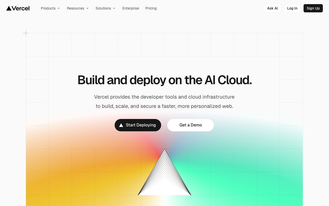
Website Preview
Colors
Primary
#000000
Page background
#FFFFFF
Primary text, logos
#0070F3
Links, CTAs, focus rings
#666666
Secondary text
#333333
Borders, dividers
Semantic
#0070F3
Success, deployments
#EE0000
Errors, failed builds
#F5A623
Warnings
Typography
Geist
Role
SizeWeightHeight
Display
64px700—
Heading 1
48px700—
Heading 2
32px600—
Body
16px400—
Small
14px400—
Geist Mono
Role
SizeWeightHeight
Mono
14px400—
DESIGN.md — Vercel
Overview
Vercel's design system is the epitome of monochromatic minimalism. Built almost entirely on black, white, and a single blue accent, it communicates speed, developer focus, and cutting-edge technology. The stark contrast creates a bold, unmistakable visual identity.
Colors
Primary Palette
| Token | Hex | Usage |
|---|---|---|
color-background | #000000 | Page background |
color-foreground | #FFFFFF | Primary text, logos |
color-accent | #0070F3 | Links, CTAs, focus rings |
color-gray | #666666 | Secondary text |
color-border | #333333 | Borders, dividers |
Semantic Colors
| Token | Hex | Usage |
|---|---|---|
color-success | #0070F3 | Success, deployments |
color-error | #EE0000 | Errors, failed builds |
color-warning | #F5A623 | Warnings |
Typography
| Role | Family | Size | Weight |
|---|---|---|---|
| Display | Geist | 64px | 700 |
| Heading 1 | Geist | 48px | 700 |
| Heading 2 | Geist | 32px | 600 |
| Body | Geist | 16px | 400 |
| Small | Geist | 14px | 400 |
| Mono | Geist Mono | 14px | 400 |
Spacing
| Token | Value | Usage |
|---|---|---|
space-2 | 8px | Tight gaps |
space-4 | 16px | Component spacing |
space-8 | 32px | Section gaps |
space-16 | 64px | Page sections |
space-24 | 96px | Hero spacing |
Border Radius
| Token | Value | Context |
|---|---|---|
radius-sm | 4px | Badges |
radius-md | 8px | Buttons, cards |
radius-lg | 12px | Modals |
radius-full | 9999px | Avatars |
Components
Button
- Primary: bg white, text black, radius 8px
- Secondary: bg transparent, border
#333, text white - Sizes: sm (32px), md (40px), lg (48px)
Deploy Card
- Black bg,
#333border, radius 8px - Status dot (green/red/yellow), deployment URL, timestamp
Navigation
- Fixed top, black bg, blur backdrop
- Logo left, links center, user menu right
- 48px height, border-bottom
#333
Do's and Don'ts
Do
- Embrace negative space aggressively
- Use white text on black for maximum contrast
- Reserve blue exclusively for interactive elements
- Keep animations subtle and under 300ms
Don't
- Don't introduce additional brand colors
- Don't use gray lighter than
#666for text on black - Don't round corners beyond 12px
- Don't use gradients in the core UI