Spotify
Music for everyone
5 colors
24 components
Circular
Apr 1, 2026
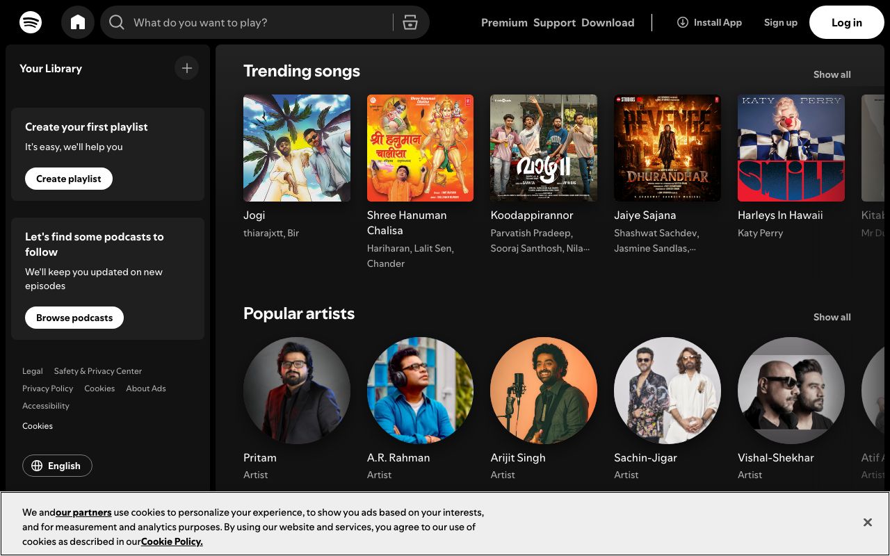
Website Preview
Colors
Primary
#1DB954
CTAs, play button, active states
#191414
App background
#FFFFFF
Primary text
#B3B3B3
Subdued text, metadata
#282828
Cards, elevated surfaces
Typography
Circular
Role
SizeWeightHeight
Display
64px900—
Heading
32px700—
Body
16px400—
Caption
12px400—
DESIGN.md — Spotify
Overview
Spotify's design system is built for immersive media consumption. The signature green is used sparingly — primarily for CTAs and the shuffle/play icon — while a near-black foundation lets album art become the visual hero. Circular, Spotify's custom typeface, gives all text a distinctive rounded warmth.
Colors
Primary Palette
| Token | Hex | Usage |
|---|---|---|
color-brand | #1DB954 | CTAs, play button, active states |
color-bg | #191414 | App background |
color-text | #FFFFFF | Primary text |
color-text-sub | #B3B3B3 | Subdued text, metadata |
color-surface | #282828 | Cards, elevated surfaces |
Typography
| Role | Family | Size | Weight |
|---|---|---|---|
| Display | Circular | 64px | 900 |
| Heading | Circular | 32px | 700 |
| Body | Circular | 16px | 400 |
| Caption | Circular | 12px | 400 |
Components
Album Card
- Square album art (varies by grid), title + artist below
- Hover reveals green play button overlay
- Rounded 8px corners on artwork
Now Playing Bar
- Fixed bottom bar, 90px height
- Track info left, controls center, volume right
- Progress bar: green on dark gray track
Playlist Header
- Gradient background sampled from cover art
- Large cover, title, creator, duration stats
- Play and shuffle buttons
Do's and Don'ts
Do
- Let album art drive the visual palette per screen
- Use green only for primary interactive elements
- Use Circular at Black (900) weight for hero moments
Don't
- Don't use green for backgrounds or large surfaces
- Don't crop album art into non-square shapes
- Don't use system fonts — Circular is core to the brand