Retool
Build internal tools remarkably fast
5 colors
25 components
Inter, Source Code Pro
Apr 10, 2026
Website Preview
Colors
Primary
#3D3D3D
Primary text
#FF5C35
Orange accent, CTAs
#FFFFFF
Page background
#F5F5F5
Builder panels
#8F8F8F
Placeholder text
Typography
Inter
Role
SizeWeightHeight
Display
40px700—
Heading
24px600—
Body
14px400—
Source Code Pro
Role
SizeWeightHeight
Code
13px400—
DESIGN.md — Retool
Overview
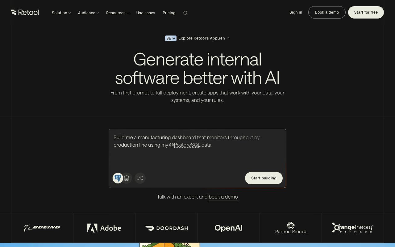
Retool's design system is uniquely dual-purpose: the builder interface is dense and utilitarian, while the apps built with it should feel clean and user-friendly. An orange accent injects energy into an otherwise neutral gray foundation, reflecting the speed of internal tool development.
Colors
Primary Palette
| Token | Hex | Usage |
|---|---|---|
color-text | #3D3D3D | Primary text |
color-accent | #FF5C35 | Orange accent, CTAs |
color-bg | #FFFFFF | Page background |
color-surface | #F5F5F5 | Builder panels |
color-muted | #8F8F8F | Placeholder text |
Typography
| Role | Family | Size | Weight |
|---|---|---|---|
| Display | Inter | 40px | 700 |
| Heading | Inter | 24px | 600 |
| Body | Inter | 14px | 400 |
| Code | Source Code Pro | 13px | 400 |
Components
Component Tray
- Left panel grid of draggable components
- Categories: Layout, Input, Display, Data
- Search with instant filter
Query Editor
- Bottom panel, tabbed (SQL, REST, GraphQL, JS)
- Syntax-highlighted code editor
- Run button in orange, results table below
Property Inspector
- Right sidebar, contextual to selected component
- Tabs: General, Interaction, Advanced
- Dynamic value inputs with {{ }} binding syntax
Do's and Don'ts
Do
- Use orange for primary builder actions (Run, Save, Deploy)
- Keep the builder UI dense — power users expect it
- Support dark mode for long building sessions
Don't
- Don't style the builder to look like the apps it builds
- Don't use orange for destructive actions — reserve red
- Don't hide the query panel by default