Notion
The connected workspace for wiki, docs & projects
5 colors
30 components
Inter
Mar 18, 2026
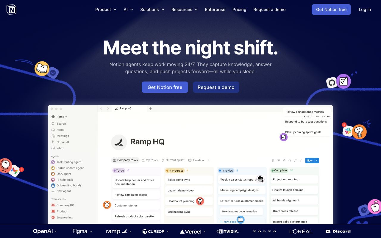
Website Preview
Colors
Primary
#000000
Primary text
#FFFFFF
Page background
#2EAADC
Links, selections
#EB5757
Highlights, tags
#F7F6F3
Sidebar, hover states
Typography
Inter
Role
SizeWeightHeight
Title
40px700—
Heading 1
30px600—
Heading 2
24px600—
Heading 3
18px600—
Body
16px400—
Caption
14px400—
DESIGN.md — Notion
Overview
Notion's design system balances warmth and function. A cream-tinted canvas with sharp black text creates a paper-like reading experience. Color is used sparingly and purposefully — primarily for interactive affordances and block types.
Colors
Primary Palette
| Token | Hex | Usage |
|---|---|---|
color-text | #000000 | Primary text |
color-bg | #FFFFFF | Page background |
color-accent | #2EAADC | Links, selections |
color-red | #EB5757 | Highlights, tags |
color-warm-gray | #F7F6F3 | Sidebar, hover states |
Typography
| Role | Family | Size | Weight |
|---|---|---|---|
| Title | Inter | 40px | 700 |
| Heading 1 | Inter | 30px | 600 |
| Heading 2 | Inter | 24px | 600 |
| Heading 3 | Inter | 18px | 600 |
| Body | Inter | 16px | 400 |
| Caption | Inter | 14px | 400 |
Spacing
| Token | Value | Usage |
|---|---|---|
space-1 | 4px | Inline gaps |
space-2 | 8px | Block gaps |
space-4 | 16px | Card padding |
space-8 | 32px | Section spacing |
Components
Block
- Fundamental unit of content
- Types: text, heading, list, toggle, callout, code, image
- Hover shows drag handle + action menu
Sidebar
- Width 240px,
#F7F6F3background - Tree structure with expand/collapse
- Quick search at top
Command Menu
- Triggered by
/key - Filterable list of block types
- Keyboard navigable
Do's and Don'ts
Do
- Use generous line height (1.6+) for body text
- Keep the palette minimal — let content shine
- Use subtle hover states with warm gray overlays
Don't
- Don't use heavy shadows — Notion is flat
- Don't use font sizes below 14px for body content
- Don't add borders where spacing alone creates separation