Linear
Streamline issues, projects, and roadmaps
9 colors
18 components
Inter, JetBrains Mono
Mar 16, 2026
Website Preview
Colors
Primary
#5E6AD2
Primary actions, active states
#171723
App background
#2C2C35
Cards, sidebars
#FFFFFF
Primary text
#8A8F98
Secondary text
Semantic
#F2994A
Urgent priority
#EB5757
High priority
#5E6AD2
Completed states
#4E4E56
Canceled items
Typography
Inter
Role
SizeWeightHeight
Heading 1
24px6001.2
Heading 2
18px6001.3
Body
14px4001.5
Label
12px5001.3
JetBrains Mono
Role
SizeWeightHeight
Mono
13px4001.5
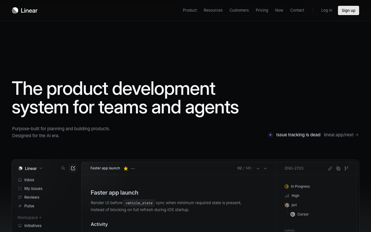
DESIGN.md — Linear
Overview
Linear's design system is defined by precision, density, and a distinctly dark-first approach. The interface communicates speed through tight spacing, sharp animations, and a restrained violet accent. The overall tone is technical and opinionated — every pixel earns its place.
Colors
Primary Palette
| Token | Hex | Usage |
|---|---|---|
color-brand | #5E6AD2 | Primary actions, active states |
color-bg | #171723 | App background |
color-surface | #2C2C35 | Cards, sidebars |
color-text | #FFFFFF | Primary text |
color-muted | #8A8F98 | Secondary text |
Semantic Colors
| Token | Hex | Usage |
|---|---|---|
color-urgent | #F2994A | Urgent priority |
color-high | #EB5757 | High priority |
color-done | #5E6AD2 | Completed states |
color-canceled | #4E4E56 | Canceled items |
Typography
| Role | Family | Size | Weight | Line Height |
|---|---|---|---|---|
| Heading 1 | Inter | 24px | 600 | 1.2 |
| Heading 2 | Inter | 18px | 600 | 1.3 |
| Body | Inter | 14px | 400 | 1.5 |
| Label | Inter | 12px | 500 | 1.3 |
| Mono | JetBrains Mono | 13px | 400 | 1.5 |
Spacing
| Token | Value | Usage |
|---|---|---|
space-1 | 4px | Inline gaps |
space-2 | 8px | List item padding |
space-3 | 12px | Card internal spacing |
space-4 | 16px | Section gaps |
space-6 | 24px | Panel padding |
Border Radius
| Token | Value | Context |
|---|---|---|
radius-sm | 4px | Badges, status indicators |
radius-md | 6px | Buttons, inputs, cards |
radius-lg | 8px | Modals, dropdowns |
Elevation
| Level | Value | Usage |
|---|---|---|
shadow-popup | 0 4px 16px rgba(0,0,0,0.4) | Dropdowns, context menus |
shadow-modal | 0 16px 48px rgba(0,0,0,0.5) | Modals, command palette |
Components
Issue Row
- Height 36px, padding 0 12px, hover bg
rgba(255,255,255,0.03) - Priority icon (16px), title, status badge, assignee avatar
Command Palette
- Centered modal, 480px width, radius 8px
- Search input at top, results list below
- Keyboard navigation with highlighted row
Sidebar
- Width 240px, bg
#1C1C28, fixed left - Collapsible sections, icon + label navigation
Do's and Don'ts
Do
- Prioritize keyboard interactions over mouse
- Use subtle hover states (3-5% white overlay)
- Keep information density high — reduce unnecessary padding
- Use the violet accent only for primary actions
Don't
- Don't use rounded corners larger than 8px
- Don't add decorative elements that don't serve a function
- Don't use light backgrounds in the main app shell
- Don't animate anything longer than 200ms