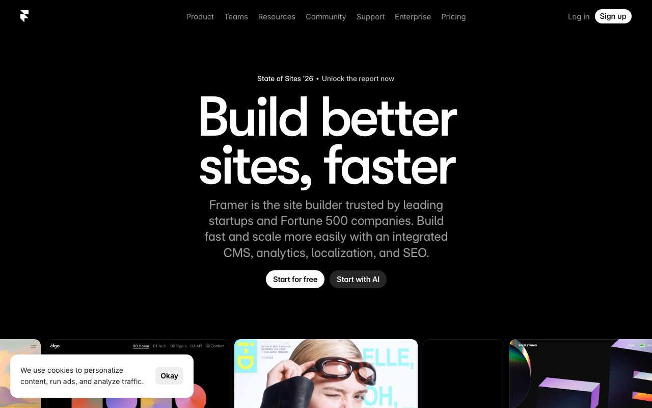
Framer
The web builder for creative professionals
5 colors
25 components
Inter
Mar 24, 2026
Website Preview
Colors
Primary
#0099FF
Primary blue
#000000
Canvas background
#FFFFFF
Primary text
#1A1A1A
Panel backgrounds
#555555
Secondary text
Typography
Inter
Role
SizeWeightHeight
Display
64px700—
Heading
40px600—
Body
16px400—
UI
13px500—
DESIGN.md — Framer
Overview
Framer's design system is a love letter to motion design. Clean black-and-white foundations with a vivid blue accent create a canvas that lets creative work shine. Every interaction is animated, communicating the product's core value of motion.
Colors
Primary Palette
| Token | Hex | Usage |
|---|---|---|
color-brand | #0099FF | Primary blue |
color-bg | #000000 | Canvas background |
color-text | #FFFFFF | Primary text |
color-surface | #1A1A1A | Panel backgrounds |
color-muted | #555555 | Secondary text |
Typography
| Role | Family | Size | Weight |
|---|---|---|---|
| Display | Inter | 64px | 700 |
| Heading | Inter | 40px | 600 |
| Body | Inter | 16px | 400 |
| UI | Inter | 13px | 500 |
Components
Canvas
- Infinite pan/zoom workspace
- Grid overlay with snap points
- Frame indicators with blue outlines
Property Panel
- Right sidebar, 280px width
- Collapsible sections: Layout, Style, Effects
- Numeric inputs with drag-to-adjust
Component Browser
- Left panel, searchable grid
- Drag-to-canvas interaction
- Hover preview with animation playback
Do's and Don'ts
Do
- Animate all state transitions (150-300ms)
- Use blue exclusively for selection and creation states
- Keep panel backgrounds distinct from canvas
Don't
- Don't use static transitions — everything should move
- Don't use shadows in the editor UI
- Don't use text larger than 13px in panels